

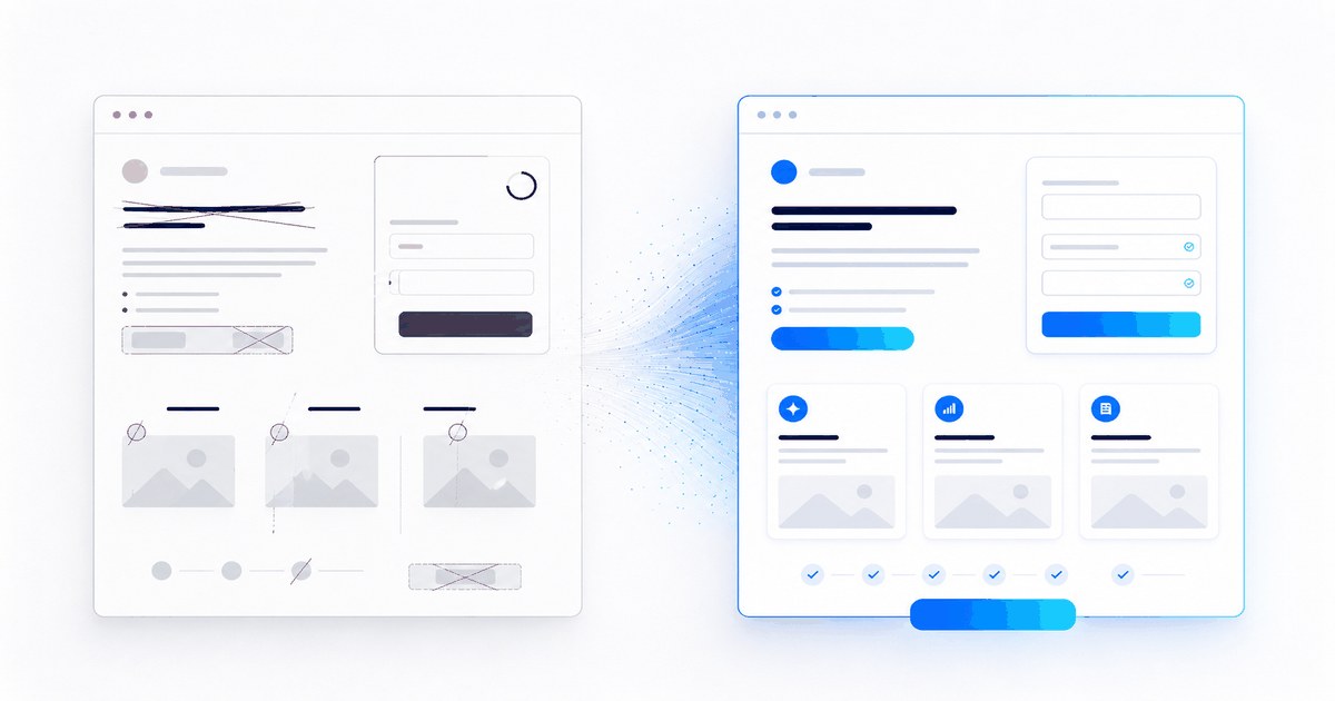
Introduction: is your conversion rate stuck? Here’s why.
You’ve launched a traffic campaign (Google Ads, LinkedIn, Facebook...). Visitors are arriving, but no one converts. You think: “It must be my products, my prices or a lousy market.”
The landing page may be part of the problem, but it is not the only possible explanation. Targeting, the offer, price, measurement and traffic quality also need to be checked.
Here are seven common checkpoints. None promises an immediate gain: they help formulate hypotheses your data can confirm or rule out.
First measure a baseline: traffic source, device, conversion goal, enquiry quality and possible tracking errors. Without this baseline, a change cannot be interpreted correctly.
Mistake 1: An unclear or missing value proposition
Users should quickly understand what is on offer, who it is for and what action is expected.
Saying “High-performance team management software” does not help them. Too vague, too generic.
A more specific fictional example would be: “Centralise your team’s requests in one place.” Any quantified promise, trial period or client reference must correspond to a real, verifiable offer.
To test: a clear headline, a subheading explaining the benefit and authentic evidence when you have it.
Mistake 2: Too many CTAs (calls to action)
- An understandable offerWhat is on offer and who it is for.
- One main actionAn identifiable priority among useful choices.
- Necessary informationFields justified by the enquiry and its handling.
You have a primary CTA, a secondary CTA, an entire navigation menu, a “View the demo” link, a “Chat with us” link...
Competing choices can obscure the priority. They can also be useful when several legitimate intentions coexist.
To test: prioritise one main action and retain only the links needed for the journey, trust and information obligations.
Copying the entire website navigation without checking its usefulness. Analyse clicks and visitors’ needs before removing or retaining a link.
Mistake 3: A form that is too long
You ask for: name, email, company, role, budget, purchase frequency, favourite colour...
Every additional field takes effort, but some are necessary to respond properly or qualify the enquiry.
There is no universal maximum number. The right form asks for useful information, explains why it is needed and respects privacy rules.
To test: remove a non-essential field, then measure submission volume, quality and the team’s ability to handle them.
A shorter version can be compared with the current version if volume allows. More submissions are useful only if quality and operational handling remain satisfactory.
Mistake 4: No social proof or trust signals
You say “Our software is amazing”. I don’t believe you. Show me.
Add:
- Client reviews: authentic, attributable and presented in context
- Client logos: only with the necessary permission
- Figures: dated, defined and linked to an accessible source
- Certifications: exact title, issuing body and current status
- Video testimonials: useful when real and relevant to the offer
Remember: one precise, verifiable piece of evidence is better than a collection of logos, ratings or figures that cannot be checked.
Mistake 5: A presentation that feels too generic or cold
Your design looks like 1,000 other websites. No personality, no voice, no emotion.
A consistent identity, a tone suited to the audience and visuals tied to the offer make it easier to understand. Their commercial effect cannot, however, be inferred from design alone.
To test: design consistent with your brand, relevant images or videos and an appropriate level of language. If the whole website lacks consistency, a well-managed website redesign can address the problem across the system.
Mistake 6: No urgency or scarcity
“I’ll look later.” Then the user forgets, clicks elsewhere and that’s it.
Add a reason to act now:
- “Offer limited to the first 50” (if true)
- “Free until 31 March” (if true)
- “Limited places for the private demo” (if true)
Be careful: do not lie. Users can spot false urgency a mile away.
Mistake 7: No explanation of “how”
A guaranteed result promised without a verifiable method or conditions soon looks like an unverifiable marketing claim.
A “How it works” section can explain the journey, responsibilities and what happens after the click.
Illustrative example for SaaS software:
- Step 1: choose the data to connect
- Step 2: check settings and permissions
- Step 3: test the first journey
Bonus: Testing and iteration
A landing page is never “finished”. Test, measure, adjust.
An analytics tool can, for example, document:
- Where people drop off (scroll depth, exit pages)
- Which CTA converts best
- Behavioural differences by source, device or variant
For an A/B test, define the metric, minimum useful effect, sample size and decision rule before launch. Duration depends on traffic and conversion frequency, not a fixed number of weeks.
Think about speed too: distinguish field measurements from lab tests and check your Core Web Vitals without automatically inferring a conversion gain.
Links to our services
If you want to examine your landing pages, explore our approach to landing page creation or our conversion rate optimisation service. We document the baseline, hypotheses, tests and their limitations.
- A clear, verifiable value proposition
- An identifiable main action
- A form limited to useful information
- Authentic, attributable evidence
- Distinctive design, not generic
- Urgency and scarcity (genuine)
- An explanation of “how”
- Test and optimise continuously
Conclusion
These seven points are neither a benchmark nor a guarantee of results. They help prepare a more rigorous diagnosis and genuinely testable hypotheses.
Start by checking measurement and the value proposition, then choose a change suited to your traffic volume. Document inconclusive results too: they prevent impressions from turning into certainties.